Looking back and looking forward…

It has taken me a while to prepare this final blog post… What should I talk about? Museum practice seminars? My final tours with entirely new groups? My impression of the internship as a whole? Or maybe even how this experience has impacted my next step….?

Why not a little bit of everything?

Museum practice seminars: As mentioned by many other interns, a large part of the internship involved hour long seminars with key members in a variety of different departments at the Art Institute of Chicago. I won’t mention all of them here but I must say that this exposure to the different career paths within a museum was an extremely valuable part of the program. Although we spoke with a total of ten departments, I sensed a common theme which seemed to effect most departments in one way or another. This theme was technology. The Director of the Art Institute, Dr. Douglas Druick, mentioned the importance of digital media in the museum. He discussed the introduction of wifi in the galleries and the push for content based tours. Additionally, he talked about online publications and sharing information with the public. In our discussion with Becky, Georgina and Hillary; Facebook was brought up as an important part of being socially significant. Even teacher workshops entitled “technology and education” have been brought into the fold.  We also talked about the use or misuse of digital media at museums like the Met with Annie one afternoon for a seminar session. Finally, in the publications department we heard about online catalogues and the advantages and disadvantages of e-books. Although each department is handling digital media in a different way- the overall consensus seemed to be that there are pros and cons to its application at this time.

Final Tours: My final tours were with entirely new groups! I gave an Art from Many Places tour to a High School group which looked at clothing as representation. I have to say I was a bit concerned prior to their arrival, as this age group had a reputation for being a bit more difficult to engage. Nevertheless, they enjoyed our first piece by the Tembu. I gave them slips of paper with various aspects of the dress on one side and the significance of these items on the other side. They were literally able to “read” the visual language of the Tembu as if they were a part of that culture. They even made connections between our marital traditions and those of the Tembu!

Tembu

Tembu “Wedding Ensemble” 1950

I also worked on the Kaleidescope event that Saturday. Drew and I led a community group which helps underserved youth gain access to extracurricular events. The majority of our group was bilingual. When a few of the girls in the group found out I speak Portuguese, they made everything into a translation game! By the end, no one wanted to leave.

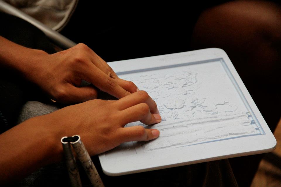
One of the most rewarding experiences of the eight weeks was the opportunity to give a tour to visually impaired high school students. We prepared the tour far in advance but quickly realized that flexibility (as with every tour) is key. A few groups overlapped at times, making it necessary to explore the gallery space “on the fly”. Nevertheless, we explored the museum through all of our senses and the students loved it! As we moved into the studio and worked on incredible sculptural forms, the students in my group continuously expressed their enjoyment of the museum. I was floored by their creativity and really felt that this studio experience was the most meaningful of the eight weeks. The students in my group created flowers out of masking tape, steam rising out of coffee cups and a 3D model of a heart beat with a single pipe cleaner and an index card.

Flowers made from masking tape

Flowers made from masking tape

Finally, my first and only family tour. Unfortunately it was hard to round people up as the museum was a bit empty on our last day. I did manage to gather two families, which made for a more intimate experience. We looked at Carl Andre, Ellsworth Kelly and Alexander Calder. Yet again, I was floored by the kids responses. At the Andre the kids wanted to walk with shoes and also barefoot across the sculpture to compare and contrast the different feelings (we made sure it was ok with the guards). At the Ellsworth Kelly we played a game where we “zoomed out” from the image of East River and saw side-ways A’s, a mask, a girl drawing eyes on a table and much more! At the Alexander Calder we saw a dolphin form, noticed the red piece next to the gold circle and broke a rule of pseudo running to get the mobile to move! The tour “ended” with a trip to the touch gallery and an impromptu coloring session. A great way to end my experience as an intern 🙂

Ellsworth Kelly “East River” 1959

Looking back and looking forward: Those first impressions from beginning discussions and readings still hold true: create a comfortable learning environment, honor each individual and his or her ideas, there is no Truth with a capital “T”, knowledge is narrative, facilitate the process of people making meaning for themselves, cultivate curiosity, offer tools for seeing, witness stages of human development, learn something new everyday, sense of discovery, give and receive, limitless possibilities. I think the only phrases I’d like to add are: the practice of always improving, the museum as a public space, passion and flexibility. This internship has solidified my desire to pursue museum education. It has enhanced my understanding of what it takes to constantly improve my practice and opened my mind to the endless possibilities of experiential learning. I am incredibly grateful for the past 8 weeks and cannot wait to pursue this work in the future.

As I look forward, I have been looking at books on the social impact of museums like Making Museums Matter by Stephen Weil and Reinventing the Museum by Gail Anderson. I’m also reading up on the use of mobile interpretation in a museum setting and wanted to share an interesting interview with Nancy Proctor, Head of Mobile at the Smithsonian Institution, as she discusses her perspective on mobile interpretation in museums.

Nancy Proctor Smithsonian Interview

Hope you enjoy the interview and thanks again for such a wonderful opportunity this summer!

wrapping up

Wrapping up, literally: One of our last Museum Practices Seminars was a visit to Art Packing! We were told that usually there are many works ‘lying around’ in the workshop waiting to be packed, but unfortunately the art packing shop was pretty sparse. Nevertheless, we agreed that Art Packing probably has the most fun office, in part because they get to blast music all day (they still have a massive collection of cassette tapes…?) I also thought it was pretty cool seeing a crate casually labeled “van Gogh, Self-Portrait” (which Emily had I had noticed went missing from the van Gogh gallery the other day), and enjoyed pondering how in the world Alexander Calder’s Streetcar  (1951) had ever been packed and shipped off. Fun fact: the Art Institute Art Packing Department invented the packing technology that allows museums to ship certain fragile works on paper, such as pastels (a blessing and a curse, one can imagine.) Also, the label for fragile/glass on Art Institute packaging has recently changed from the classic image of a fractured glass to an image of a fully intact martini glass with olive. An important and worthwhile change, in my opinion.

While on the topic of Museum Practices Seminars: last week we also met with photography curators Elizabeth Siegel and Kate Bussard. This ended up being one of my favorite seminars because I really enjoyed learning about and discussing some of the issues and concerns that surround photography. Perhaps many of you are familiar with these ideas, but nevertheless, here are, for me, some important and interesting points that came out of our seminar:

  1. Both curators pointed out the fact that in a museum that divides its departments into categories that are based on time periods (Medieval to Modern, Contemporary), cultures (Asian, African, Art of the Americas), and media (Prints & Drawings, Photography, Textiles, Architecture & Design), there will be inevitable overlaps in interests (contemporary and photography) as well holes in the collection (non-western photography.) Photography itself, while it refers to a specific media, is obviously also inherently time-specific. Kate Bussard expressed a particular interest in expanding the photography collection to include more non-western contemporary photographers, and African photographers, in particular. I’d be interested to learn more about how photography is different–stylistically, in its production, who are photographers, subject matter, meanings attached to it–between cultures.
  2. One question that came up regarded how photographs are valued–how do they differ (do they?) from the way prints are valued (using the edition system). The curators explained that they always buy/accession prints–never photographs in digital form. A photograph as a piece of art means the artist has printed the image in a specific way–the act of printing is part of the artistic process because it involves the artist’s intention. They added that vintage photographs (photographs printed within a couple years of the negatives) are more valuable than photographs printed later or posthumously. Finally, they noted that whether or not a photograph is digital or uses fancy modern technology doesn’t matter: photographers have been employing tricks ever since photography was invented. These elements are part of the artistic process/the materials employed to make the artwork just as paint is used to make a painting.
  3. During our seminar Moses asked a question that was on my mind: will Facebook, Instagram and/or the Internet in general change photography as an art form/how it is appreciated? Both curators felt that the Internet does not have much of a bearing on fine art photography. As noted above, photography as art includes the process of printing a negative or digital file. As with any other work in the museum, the photographs in the AIC’s collection are valued as objects (back to that idea of the “objectness of objects“) that have traveled, have survived various circumstances and that have made their way to the museum. Their concern, rather, was one that is similarly shared by other curators: that the digitizing of museum objects will make visitors less compelled to see them in person, especially 2-D objects, and even more so, objects such as photographs, which we are so used to ONLY seeing on the Internet. We wondered, still, will Facebook/Instagram ever shape what is considered art? Might artists use these venues in the future for some aspect of their process?
  4. As with Prints and Drawings, works can only be up for short periods of time and so shows change often (approx. every three months.) The curators are always very busy arranging new exhibitions. Like Prints and Drawings, too, the public can still make appointments anytime to see photos in the Photography Study Room. Anyways, the day after the seminar, Emily and I went to check out Kate Bussard’s new show, “Film and Photo in New York.” Two thumbs up.

Louis Faurer, New York City, c.1949; © Mark Faurer

Tying things together: For my last week I gave two Modern Wing Highlights adult tours. As with my first Adult Tour experience, I found giving Modern Wing adult tours to be particularly rewarding. Although it would have been great to be able to draw from the rest of the museum, when limited to the Modern Wing, one ultimately always uncovers some thread that allows you to consider the progression of modern and contemporary art in some particular way. In other words, because of the limited time period, any set of six works will link in a way that tells the story of modern and contemporary art.

For example, Moses and I decided to look at the figure in space in modern art. Moses presented on Giorgio de Chirico’s The Eventuality of Destiny (1927), Constantin Brâncusi’s Golden Bird (1919/20), and Alberto Giacometti’s Walking Man II (1960). Meanwhile, I presented on Georges Braque’s Woman at an Easel (Green Screen), 1936, David Hockney’s American Collectors (Fred and Marcia Weisman), 1968, and Katharina Fritsch’s Monk (1997-99). While observing how artists render figures in spite of the space they inhabit (de Chirico), figures that are dependent on the space they inhabit (Braque), figures that implicate the viewer into the space of the painting (Hockney), figures that are figural in the way that they represent the essence of a living creature (Brancusi), or figures that continuously cause the viewer to reevaluate how close he would like to approach (Fritsch), we also were able to discuss other major themes and movements (surrealism, cubism, pop art, minimalism) in modern and contemporary art.

I also developed new-found love for the Braque and the Fritsch. To me, Braque’s is brilliant in the way the figure is conflated with the space. He self-references the decorative nature of his painting by making her profile view reminiscent of classical Greek vases with black figure painting (and through the vase the woman paints on the canvas). While it is hard to determine how the figure relates the flattened space she inhabits, we can easily discern that the work is divided into three parts–maybe these are three perspectives, but they could also represent three points in time. As you move rightwards, the space becomes more and more three-dimensional. (Why might that be?) I could go on, but how about you look for yourself:

Georges Braques, Woman at an Easel (Green Screen), 1936

The Fritsch, to me, is also brilliant in the way, compositionally, it continuously draws the viewer’s eyes upwards until one gets to the figure’s eyes, which, in turn, draw the viewer’s eye down again; everything about this work in inward-looking. Even the matte black paint acts like a black hole. As a viewer, you find yourself wanting to approach and yet a bit frightened to get sucked in. The connections to pop art, minimalism, and the German Romantic movement (with its interest in medievalism and the gothic) all made this piece even more interesting to me:

Katharina Fritsch, Monk, 1997-99

Then on Wednesday, I did an adult tour with Matt about the breaking down of the division between the two-dimensional and the three-dimensional in modern and contemporary art and, additionally, the different ways art transcends its traditional role as artwork and interacts with the life of the viewer. Matt presented on Robert Rauschenberg’s Short Circuit (Combine Painting) (1955), Eva Hesse’s Hang Up (1966), and Felix Gonzalez-Torres’s Untitled (Last Light) (1993). Meanwhile, I presented on Pablo Picasso’s portrait of Daniel-Henry Kahnweiler (autumn 1910), once again on David Hockney’s American Collectors (Fred and Marcia Weisman) (1968), and on Gerhard Richter’s “Ice” series, Ice 1-4 (1989). In my presentation on Picasso, I got the audience to consider how Picasso wanted to represent our three-dimensional world on a two-dimensional surface in a way that he saw was most realistic and most honored the two-dimensionality of the picture plane. In talking about the Hockney, I had the audience observe how the stage-like setting Hockney creates implicates the viewer into the space of the painting; even though this is a two-dimensional work, Hockney skews his perspective and engages a kind of voyeurism to force the viewer into the space of the scene. Of course, Hockney also represents three-dimensional artworks IN his painting while also turning the figures into kinds of sculptures themselves. (I should note that I could NOT get the audience away from this painting–which was awesome!) Finally, with the Richter, I discussed the artist’s painting process of scrapping away and how that differs from the typical two-dimensional painting process that is usually an additive one. In turn, I talked about how Richter, throughout his oeurve, was concerned with the limitations of painting and was interested in exploring how it could relate to other media (photography, in particular.) We also considered whether these works were abstract expressionist or realistic depictions of something tangible (ice); in arguing for the latter, I, and several audience members, proposed that these paintings’ use of color, line and paint application help to evoke the coolness, subversiveness, and rigidity of ice.

Ice (1)

Ice (2)

Ice (3)

Ice (4)

 Wrapping up, figuratively:

The final couple days the interns spent a considerable amount of time getting ready to say goodbye to the museum. As many of us have blogged about throughout the summer, one of the best parts of working at a place like the AIC was the opportunity to explore the massive collection and become familiar with objects, cultures, and media that we arrived not knowing much about. We all shared in the experience of discovering new favorite artworks that we liked to use on tours/visit often. In turn, the last week at the museum meant saying goodbye to our favorite artworks. Several of us went around together and had our “last look”…for now.

Bidding “farewell” to my favorite Seated Ruler in the Art of the Americas

A couple of interns have mentioned that we made a video for the Education Department as a way to say goodbye and thank you for all that we learned. Moses can be credited with putting this together (and starring in a lot of it), but since he has yet to upload it, I thought I’d include it here:

Finally, the Education Department held a lovely goodbye reception for us. It was a wonderful feeling thinking back to the first week when we had a welcome reception; I remember how we interns felt a bit uncomfortable being in a room of unfamiliar faces. But this time around it was a room of familiar faces–of lots of people who helped us out and cheered us on all throughout the summer. It was great to feel like we had become part of such a wonderful community of educators. Thank you, thank you, thank you everyone for all of your support and enthusiasm and welcoming spirit. I know I speak for everyone when I say this truly was a wonderful and exciting learning experience and one of the happiest summers ever. Thank you.

Reflection on the Last Eight Weeks

To start, I really want to express how awesome Moses is for not only the amazing video presented at the farewell reception, but also for letting me to take his tour for the visually impaired high schoolers. This tour ended up being my last tour and was also the most anticipated, challenging, and fulfilling. Hands down one of the best experiences I have ever had in a museum with a group of individuals.

All tour photos were also taken by Moses, so feast your eyes on the amazing photography to follow!
For my first stop, we were in the Ando Gallery, and we discussed atmosphere, sound, smell, and touch. All the students explored what other spaces the Ando Gallery reminded them of, such as a forest or a movie theater with surround sound. We compared the smooth, vertical wooden pillars to the wood on the long, slung, and slightly rougher benches, contemplating Ando’s choice of materials and textures as a way to draw attention to their similarities and differences.
Image

Image
For our next stop, we went to the Trompe L’Oeil, where they experienced the tactile drawing of the piece and the satin material of the curtain.
Image
The Touch Gallery was also a big hit with the students, exploring the variety of materials, the Braille labels, and the connection between facial expressions and narratives.
Image
We took our tour outside to explore the Scott Burton piece outside of the student group entrance, to discuss placement, environment, and materials.

I could write a long blog post entry about what this internship has meant to me as an educator and individual, but I’m pretty sure I lack the sufficient vocabulary and grammar to capture all the emotions I feel currently. So instead, I’m gonna exploit the 1000 word-worth of pictures.

So imagine you’re about to embark on a quest, a long and far journey away from home…

You can go by train…

By art packing truck…

Or by kayak!

You’ll meet people, some you’ve met, others you haven’t yet…

Maybe you’ll see amazing natural wonders..

And maybe you’ll meet a wise man who tells you to go places

Like above the clouds

And find yourself in a strange world

Encounter danger

Discover pleasant surprises

Eventually, you’ll be on your way home..

But you’ll be thinking about the strange things you encountered on your journey

And most importantly, never forget the amazing people who helped you because the journey is always so much more important than your destination..

And perhaps there will be a big party when you return

Thank you all for so much for everything and more. To a bright, artful, and beautiful future!

Looking Back: My Favorite Works on Display at the Art Institute

White Crucifixion

White Crucifixion, 1938
Marc Chagall

Saint George Killing the Dragon

Saint George Killing the Dragon, 1434/35
Bernat Martorell

"Brighton, England, August 21, 1992," from Beach Portraits

“Brighton, England, August 21, 1992,” from Beach Portraits
Rineke Dijkstra

Monk

Monk, 1997–99
Katharina Fritsch

Sandvika, Norway

Sandvika, Norway, 1895
Claude Monet

Dorothea and Francesca

Dorothea and Francesca, 1898
Cecilia Beaux

The Praying Jew

The Praying Jew, 1923
Marc Chagall

The Boxer

The Boxer, 1942
Richmond Barthé

Moulin de la Galette

Moulin de la Galette, 1889
Henri de Toulouse-Lautrec

Stag with Herb Branch Mounted as a Ring

Stag with Herb Branch Mounted as a Ring, late 16th century
Gift of Marilynn B. Alsdorf

Houses of Parliament, London

Houses of Parliament, London, 1900-01
Claude Monet

We Will Not Become What We Mean to You

We Will Not Become What We Mean to You, 1983
Barbara Kruger

Self-Portrait with Camera

Self-Portrait with Camera, c. 1917
Edward Steichen

Ando Gallery

Ando Gallery, c. 1992
Tadao Ando

I am so grateful I had this experience — I learned a lot about myself and about what it takes to be an effective educator. I’ll never forget what it felt like walking around the galleries in the morning, before the museum opened… and the look on students’ faces when they shared their feelings about a work of art for the first time. Thank you so much to everyone who supported me throughout this internship. If you’d like to keep in touch (or get a hold of me!), follow me on Facebook or bookmark my website.

See you around!

Kat

Our Very Last Day

This past week…

The moment we’ve all been dreading has arrived: our last day at the AIC has come to an end.

I cannot over exaggerate what a great experience these past 40 days have been. From work with a genuinely kind group of museum educators to engaging with the public through tours, this experience has been as fun as it’s been enriching. All of this makes writing a last blog post all that much harder.

In these past 8 weeks, I have slowly become more comfortable looking at artwork. As an art history student, my study of art was through lecture-based classes and reading textbooks. This setting provided necessary and often complex historical, aesthetic, and cultural context. However, I wasn’t always challenged to share my beliefs and relate my own life experiences to a work of art. Being a museum educator, I had the chance to practice firsthand looking closely and relating personal association to works of art. 

This close connection between life and art became my primary means to interpret artwork for my tours. Not surprisingly, this theme was one that came up this past week for an adult tour I gave with Hannah on the interactions between sculpture and painting in the Modern Collection at the AIC.

For my first work of art, I chose the autobiographically rich combine Short Circuit by Robert Rauschenberg. Of all the works that I presented during this summer, I can honestly say that this presentation is the one that I am the most proud of.

Image

“Can anyone identify the things they see?” I asked the group of 30-ish guest, 5 of which were friends and other interns coming to support me.

The answers included: an American flag, a photograph of Abe Lincoln, doors, soft fabrics, a postcard, and some “weird” age-worn papers.

This prompted me to asked, “And, how do these relate to one another?”

This question came with a bit more of a silence. The crowd seemed a bit uneasy and didn’t respond at first. I still waited and let the audience ponder.

“It kind of reminds me of a family album,” said one gentleman.

From there, the dialogue ensued and I was able to convey to the group the rich and highly personal qualities of the combine. Even more, the group came to the conclusions that the artist integrated multiple mediums in order greater address not only his own life but relate his experiences to the viewer.

After the tour, one gentleman came up to me and shared, “I’ve never been a fan of Modern Art, but you really made me consider it and gave me a reason to slow down and look at it.”

This brings me to why I’ve found museum education to be such a rewarding experience. Just getting one person to come up to you and tell you that they understand art better and why it’s important makes the job all that more worthwhile. Before this summer, I never considered seriously making art accessible to people who didn’t study it. The historical and aesthetic value of art had always been apparent to me. Now, I’ve learned how to relate my passion to other people in a meaningful way that encourages future personal inquiry.

Although there are many other things I’d like to share about this summer, I am going to reserve that for another time. But, I must ask you to indulge me in one more discovery from this summer. I’ve always wondered what the two figures in the foreground are looking at in Gustave Caillebotte’s masterpiece Paris Street, Rainy Day.

 Image

CASE SOLVED!

The Art of Licking Paintings and Other Surprises

(So technically the last day of our internship was yesterday but I forgot to post this, so I’m doing it now). Before I explain my title, I’d like to recap the last couple of weeks of surprising artworks.

The 8-Second Rule: As Hannah mentioned in an earlier post, on average- people spend only 8 seconds looking at a work of art. With our recent museum practices seminars and adult tours- I’ve realized that if you aren’t looking closely you really miss out.

Go Figure: I worked with the lovely lecturer Margaret Farr on representations of figures in modern and contemporary art. I presented 3 of my new-favorite AIC works (each of which requires closer looking):

1. Feeling Blue: Picasso’s Old Guitarist shows a faint outline of the hidden figure of a woman underneath. Audience members noticed the subject’s form was elongated, appeared broken, and was not even fully contained by the panels. As I mentioned in a previous post, the conservation findings of this work are particularly interesting.

2. Celebrity Encounter: Richter’s Woman Descending the Staircase looks like a photo from a distance but you can see the brushstrokes if you come up close. The adult audience noticed the blurring of her form made her appear confident and ethereal. Many believed this was a depiction of Sophia Loren, but the subject’s identity remains unknown.

3. The Dark Side: Fritsch’s Monk – well, Monk is the opposite. The work’s matte finish, backlight, and barrier prevents viewers from getting much more visual information close-up than they did 10 yards away. People often don’t see the wire barrier, and in an attempt to get closer – they trip! Adults said that although he was a monk who appears to be meditating, he gave them an eerie feeling as they approached.

Artful Relationships: Kat and I gave a tour of the historic building and looked at relationships in art (of depicted figures, of the space, of the artist). Kat presented on the iconic American Gothic and the fascinating and frequently overlooked Boxer. Again, there’s more than meets the eye at first glance.

1. Spectacular, Spectacular: Our first stop was Toulouse-Lautrec’s At the Moulin Rouge where the unsettling depiction of May Milton on the right-hand side was previously cropped out and later reattached. If you look closely you can see where conservation treatment took place.

2. City Slickers: Caillebotte’s Paris Street includes minute scaffolding in the distance to represent the long process of Haussmannization. (Look to the left of the lamppost.) In addition, one of the only non-flaneurs is located to the right of the woman’s hat. (She’s shown wearing an apron.)

3. Better Half: We stopped through the Alsdorf Galleries at Shiva as Half-Male and Half-Female where details in body parts, dress, jewelry, and stance indicate the right side represents the Hindu God Shiva’s consort, Parvati.

The “isms” tour: Tiffany and I led an “isms” tour through the Modern Wing. Tiffany presented Kandinsky’s Painting with Troika, Dali’s Invention of Monsters, and Wanders’s Snotty Vase.

1. Feeling France-y: I led the group to Matisse’s Interior at Nice where the composition is repeated in a smaller painting on the wall in the hotel room. His use of light and of repetition was a focus for the group. Known for his works in Fauvism, this work showed Matisse’s progression towards Impressionism and Naturalism.

2. Big & Beautiful: Next I took the group to De Chirico’s monumental Eventuality of Destiny. The work’s classical elements, together with the subject matter, led researchers to believe de Chirico painted the three Fates. My last stop was to Fritsch’s Monk- again. (I really do think it’s a great work for getting audience’s reactions).

To Conserve and Protect: We finally got to tour the AIC’s Conservation Department with Francesca Casadio and Frank Zuccari. We prepped by reading the special Museum Studies issue of AIC Conservation. My only previous exposure to conservation was at Emory University’s Carlos Museum. I was really curious to see how the AIC’s department compared.

First Responders: The main goal of conservation is to preserve works of art by extending their life expectancy. Much of their work is preventive conservation. Most works have inherent vice where separate components react differently to environmental conditions that can undermine structural stability. Another important aspect is irreversibly. Conservators always want their work to be undone if better methods are found in the future.

Down the Rabbit Hole: The conservation department was too cool for words. There was one room containing art that was in the process of getting treated. Propped against the wall when we entered was a monumental Picasso painting (pictured below) that I had noticed had been missing from the galleries. In addition, Francesca showed us cross-section samples of Impressionist paintings for a new study on the grounds used by prominent Impressionist painters like Monet and Renoir. The department is also currently doing studies on Ripolin, an industrial paint used by artists like Picasso.

Licking Paintings: One of the conservators showed us an egg-tempera Renaissance birth painting showing a chubby cherub figure. It will be on display for a show in a few years. Initially it had been an octagonal composition, but at some point it was cut in half and turned into a rectangular easel painting. Because the painting was roughly 500 years old, the old and yellowed varnish had to be removed. We saw it at this stage, before the new varnish had been applied. The background was difficult to make out without the varnish. It looked dusty and blurry. To show us what it will look like the conservator licked her finger and then rubbed it over the painting’s surface. (Of course, all the interns were shocked. But then I recalled how at the Carlos Museum conservators use spit to clean Greek statues, and then it didn’t seem so crazy to me.)

Loss Compensation: Conservators also  take into consideration what is necessary to fill and restore with works of art. Are the losses so glaring that they would distract viewers? Does it impede reading the work as an aesthetic object? My understanding is that first you do whatever is structurally necessary to preserve and protect the work. Aesthetic motivations come second. I was surprised, for example, that the conservator working on the Renaissance birth painting was doing a significant amount of in-painting. A red shield on the left side of the composition was barely recognizable. When I asked the conservator what she intended to do with that portion, it seemed that she would try to restore it to it’s former glory. It made me wonder- if viewers knew that practically none of that portion of the work was original, would they feel cheated? I was never really exposed to the conservation of paintings at the Carlos Museum because most of the collection is comprised of archaeological finds (statues, sarcophagi, ceramics). I wonder if extensive loss compensation is more acceptable/necessary with paintings than it is with objects from antiquity. Overall, the exposure to different approaches and methods of conservation has been an enlightening experience.

To sum it up: Don’t just breeze by a work of art. You are missing out on more than you know!

I’m working on a great blog post. This is not it.

It has come to my attention that some of my colleagues are relying heavily on pictures that they took for their blog posts. I decided that I’m just as artsy and that you should all understand that.

So here are some pictures I took of Chicago.

Analysis: By making this extremely blue it looks like electricity, or an explosion. By taking a picture with a sign that has the word Chicago in it, you know that this picture was probably taken in Chicago, so it’s poignant.

Analysis: The vignette and blurred edges evoke a sense of nostalgia for the art deco period that influenced the construction of many Chicago buildings. By heightening the brightness and contrast, it makes it more difficult to see my finger, which is in the bottom, but you can still tell it’s there. The finger is a reference to the human presence in the structure.

Analysis: I totally took this picture, in the tradition of Lichtenstein. Adding a watermark and url reminds us of the corporate reality of images in a digital era. Turning it upside down highlights to absurdity of this new era of commodification. And it looks cool in blue, I like blue.

Analysis: A simultaneously ironic and non-ironic statement about American pride, especially in light of the olympics. The vignette effect is always classy.

Analysis: This is not actually an artistic shot, but Hannah and I happened to meet Derrick Rose at Panera.

Analysis: I thought the best way to really understand Chicago was an extreme aerial view; to really understand its place in the world and how integral it is to America. The red dot symbolizes Chicago. The word Chicago reminds us of that. The fact that Canada and Mexico have their names written on them reminds us that they are not America. America is portrayed as yellow because it is essentially a nation of corn. It is highlighted in a red box to underline both it’s importance on the world stage as well as the danger it is in, constrained by China.

I just wanted to show these to you to help give you the impression of Chicago that I am getting. A beautiful, blue-tinted city.

P.S. I love this internship.

Science As Art (An Ode to Astrolabes and Wanders)

Sorry for the title fail, I’m really not as creative when it comes to these things as my colleagues. Following my theme from last week, I’d just like to share the cool stuff I found in the process.

I had my science tour for high schoolers (and some who were about my age) which went really well all things considered. As I researched more about astrolabes, I really began to fall in love with them as objects and works of art. The Adler Planetarium had an amazing section dedicated to them, as I mentioned in my last post, but I found this really interesting TEDtalk by Tom Wujec which sums up their history and uses really nicely:

Astrolabes from the Adler Planetarium at the Art Institute of Chicago
Gallery 205

After describing the astrolabes as 16th century smartphones, only with way more intuition in terms of understanding how the planets, stars, and sun moved in the sky, the students all had a moment of self-reflection on just how reliant modern day people are on easy, one-touch do-it-all gadgets. Their beauty as cultural emblems and works of art also merges nicely with the idea of science as art, as both were addressing how to understand life as a whole.

I hate to play favorites, but because it’s officially taken down now, I can’t help but mourn the loss of Marcel Wanders’ Snotty Vase, which I featured in my Science tour as well as in my adult tour on “-isms” with Emily. I know everyone is tired of me talking about this piece, and please feel free to skip through if you’re one of the unfortunate ones to hear me ramble about the amazing process. But for those who do not yet know Snotty Vase, you shall (and must). Caution: please put away all food items before proceeding.

As mentioned many times previously, I have presented Adriaen van der Spelt and Frans van Mieris’ Trompe L’Oeil in scientific lens, focusing on the hyper realistic details of the composition as evidence that artists were intrigued with close looking using innovative microscopic lenses.

Adriaen van der Spelt (Dutch, 1630-1673)
Frans van Mieris (Dutch, 1635-1681)
Trompe-l’Oeil Still Life with a Flower Garland and a Curtain, 1658

So how does this seem to relate?

Marcel Wanders (Dutch, born 1963)
Manufacturer: Cappellini S.p.A. (Italian, founded 1946)
Airborne Snotty Vase: Influenza, 2001
Polyamide
15 x 15 x 15 cm (6 x 6 x 6 in.)
Restricted gift of the Architecture & Design Society, 2007.61

Well for one, both are done by Dutch artists, and second, there’s this fascination with flowers:

Ta-da! They’re flower vases!

Yes ladies and gentlemen, they’re vases modeled after a sneeze, or a “snotty,” as Wanders calls it. Using high-tech scanning, Wanders was able to have someone with influenza sneeze into a scanner which then took a picture of the particles emitted. Then magnifying the image on a computer, he was able to isolate a particle identified as influenza; then magnified that by 1000x, added holes, and then used SLS printing to create a polyamide flower vase…modeled after a sick person’s sneeze. Talk about close looking…

Emily and Hannah have written about Tom Burtonwood and Mike Moceri gracing the Art Institute with their awesome FDM printers and spools of plastic which can be found in Legos. I was really interested as well to learn more about 3-D printing since Wanders, ever the innovator, used it for his Airborne Snotty Vase series. Talking to Tom and Mike, I learned more about the various 3-D printing processes and polyamide as a material, thus gaining further insightful appreciation for the Snotty Vase‘s undulating branch-like form being created from a pile of powder and resin, with a laser guiding its shape. Oh the things you learn from all perspectives and studies!
All the fun 3-D printed worksIn addition to giving me knowledge that no art history textbook would most likely hold, it was also really fun playing with Yoda busts, Sue’s skull, and Maurice the lion. To spread the joy, be sure to check them out at this year’s Evanston Maker Faire!

I really appreciate Wanders’ works because they are humorous, but not jokes. They’re thoughtful, well-executed, and above all, conversation starters. Wanders himself regards humor as a beautiful way to open hearts, to connect to people and fill these open hearts with new and positive ideas. His steadfast belief that “we can no longer use humanity to serve technology, we have to use technology to serve humanity” means that he truly believes in the power of design to touch the lives of every day people because they involve functionality. And his dedication to nature and technology as one and the same is also something which has made me consider my interest in science as art, rather than art as science.

For now, I’d like to leave you all with the following Marcel Wanders’ quote, found in his book Behind the Ceiling:

“My most important work is my life, my personal masterpiece. If I have one professional motivation, it’s to inspire people to make their lives masterpieces.”

Lions, Tigers, and CUBS

Warning: This is an image-heavy post.

Tiffany and I escaping the rain.

Week of the ‘Wild’: Dressed in legitimate Cubs fan attire, the remaining interns (who had not been taken down by the flu, funky stomach viruses, and sprained feet) had a great time! A torrential downpour caused the game to be called in the 8th inning. But WE WON! I also finally went to the zoo and saw all the great cats (like tigers) and the sun bears that Moses raved about in his first post.

Power Tripping: I had been playing with the idea of representations of power figures in the museum and got an opportunity to explore them with two student groups in a  “Power” tour.  I asked the kids to think about types of powerful people and one boy immediately screamed “a knight!”- which coincidentally was our first stop.

1. Heavy Metal: We looked at a traditional representation of power (St George Killing the Dragon) and noticed how the artist depicted the knight’s power (ornamentation, weaponry, size, placement, context of facing a formidable foe). We stopped in Arms & Armor and realized knights would have had to be incredibly physically strong just to wear them.

2. Japanese Zeus: We looked at a muscular thunder deity from Japan called Shukongojin. Noticing his physical strength and frightening appearance, students learned that those were part of his purpose as a protector of sacred spaces. Everyone was curious about his 3rd eye – his “all-seeing” power.

3. King of the Jungle: I finally used my Lion from the Alsdorf (above). We looked at the way it is depicted, its human qualities, and the adoption of lion imagery by kings and queens as a symbol of power.

4. Power of Poise: We ended at Gerhard Richter’s Woman Descending the Staircase and contrasted the work to previous stops. The kids shouted “She’s not a god!” “She doesn’t have armor or weapons!” “She’s not as strong as a lion!” But each agreed that she was also powerful because she looked CONFIDENT. Each student tried to copy her pose and describe how they felt standing that way. Perceptive 4th graders also noticed that Richter’s method of blurring the painting made the woman look like she was moving, making her pose more dynamic. To end the tour, they each named ways that they themselves are powerful.

Tech Trek: In a twist of fate, Tiffany and I were wandering around the REC later the same day and stumbled upon classroom filled with figurines. We decided to check it out and this is what we found:

3-D Printing and Products!

Moses with Yoda replicas.

Me with Sue from the Field Museum.

Tiffany with a lion and hand.

Kendall making funny faces with sculptural figurine.

Hannah and tiny tomb guardian.

How it Works: Photos from different views of an object are compiled into a program, which then makes a composite image.

You then hook that up to a 3-D printer and it lays down strands of plastic (the same kind that Legos are made of) onto a plate heated at 100 degrees Celsius.

Tom Burtonwood (pictured above) and Michael Moceri (below) gladly indulged our flood of questions while they explained the process, the technology, and the applications. Mike introduced us to Thingiverse, where people can share things they have made or designed.

When scrolling through uploaded object files, Kendall noticed the file for my favorite Lion from the Alsdorf- that I had just used that morning! I got too excited of course, and Mike offered to print it out for me! (see the pics and video below).

Taking only about 15 minutes to print, it’s an incredible likeness!

“An App for That”: The applications for this kind of technology in a museum would be an interesting (and contentious) topic. Would it be mostly for a gift shop or would it serve a broader purpose? What kinds of legal questions does this conjure? The concept of technology and the museum has been a topic of recent discussion in the docent room and in this blog.